

 |
| Pen and Water Wash with stamped letters Crummy watercolor journal 3.5" x 5.5" |
There are times when I want to sketch and there are times when I want to sit back and absorb what's going on around me or to focus on the person I'm spending time with.
I can fall into my sketchbook like some people fall into their smartphones and it can damn annoying to someone who doesn't sketch. Or so I've been told.
For me, often the point of sketching is to create a portal, or return ticket, back to a moment I want to remember. In this instance, I wanted to remember the "pity pot" and a quick sketch was all that was necessary.
As we sat together, it took a few minutes for me to grasp the idea that the pity pot was a toilet and when my friend was done with her pity party, she simply hit the handle to wash all the negativity away!
It amused me and it delighted me that she had found a way to deal with some of the ongoing, life challenges she's facing. Like most of us, she's dealing with her fair share of "stuff."
She also puts a timer on her pity parties and sets a firm deadline, say 4 o'clock in the afternoon before her family comes home from their day, by which to end her party. That way she doesn't fall into the trap of lingering too long.
At the end of her party, she ceremoniously flushes the toilet and watches the water swirl the pity away and out of her world. Clever, huh?!
And that's what I have to show for the last two weeks.
 |
| Assignment from An Imaginary Trip To Canada |
But not futility.
What I've learned is that sometimes it pays to keep going even when all the lines are wonky, proportions are off and well, it looks like a toddler got busy on the page with their crayons.
Because it turns out okay in the end.
If you're on location in some beautiful local and you woke up not knowing which end of the pencil to use, would put your sketchbook away and just take photos while telling yourself you'll draw it all out when you get home (knowing you probably won't)?
There's a quote I recently discovered by Mark Twain:
Continuous improvement is better than delayed perfection.
Huh. That says it about as well as it can be said.
And that explains my approach to the page above and to sketching in general. The page above is part of the Imaginary Trip To Canada class currently going on and the page above is on the back of the first page I did for the class. I didn't want to skip it.
The very first mark I put down on the page was incorrect. But I figured if I just kept going, I'd work out the kinks and hit my stride.
My stride was no where to be found that day.
The clock tower is probably the worst of the drawing, but the sailboat's mast looks drunk, the box around the lighthouse is way off and the lighthouse itself looks a little bizarre.
When I finished with my sketch, this is where I was:

Some folks think that adding color will "hide" incorrect proportions or perspectives.
They're only half wrong. Color alone won't hide anything:

You can see from the comparison above that the clock still looks pretty wonky even with the color added.
However, when you use some other strategic techniques along with some that use color, you can help to direct the eye so that the wonky becomes more of "the hand of the artist" and less of the "I forgot how to draw."

In this case, I used the following techniques to both disguise my challenged drawing and to re-direct the viewer's eyes:
- I created layers of "stuff" to look at. By adding the map in the background, it pushed the other items on the page forward. By placing the boxes over the map but behind the boat, clock and foghorn, I built a back, middle and foreground. This creates a push and pull of items to entertain the viewer.
- By placing the blue wash around the land mass, I also created a unifying wash that creates one overall element with lots of smaller components. Kind of like a map of the United States is one land mass with the various borders creating the states within. If I had stopped with just the clock, it would have been front and center and quite obvious that I had trouble drawing that day. By adding the other elements, I took the pressure off the clock drawing.
- I also used a color trifecta to lead the eye around the page. Did you notice the red foghorn first? Then the lighthouse and the lettering? That's because I've used the red to move the eye around the page rather than letting the viewer just "read" the page. By using a strong color ( and it doesn't have to be red,) in three or more distinct places, it moves the viewer's eye around. You'll note that it doesn't direct the viewer's eye to the clock or drunken mast.
- The sailboat and the clock serve as "brackets." All the information held within them is about Prince Edward Island and it gives the viewer a visual clue about the page. Because the sailboat and clock are visually balanced as long verticals, it again takes the eye away from the wonkiness.
As you may have guessed, I work directly in permanent pen, especially when I'm on location because it saves time and it keeps me out of the "Oops Loop." I'm sure you've dealt with it...you're working in pencil and you realize your lines aren't working so you erase and redraw. Then you do it again, and again and again, and finally something that should have taken five minutes ends up taking thirty. Not to mention the paper is now messed up.
Working on location is often a once-in-a-lifetime opportunity. I'd rather take Mark Twain's advice and work on continuous improvement rather than delay until I get home and hope for perfection.
What about you—do you give up on a wonky drawing too soon or do you push through?
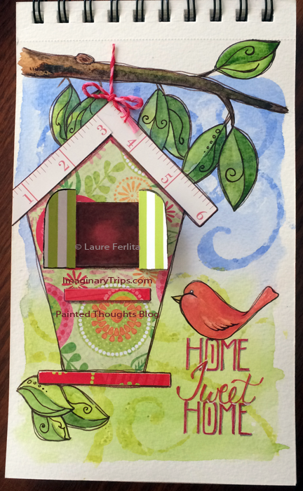
Tomorrow, down at Keeton's in Bradenton, I'll be doing a live class and we're going to be working on a mixed-media page using scrapbooking paper as the main design with watercolor, stencils and colored markers to make a fun and festive page.
Come and join me if you can! More info here. Hope to see you there!
After coming home from a trip, I always have grand plans for all the pages I'm going to do based on the great photos and wonderful memories I have. Sound familiar?
And then life, work and daily living gets in the way. Sound even more familiar?
Those pages still exist, but they're only in my imagination and they fade with each passing day.
Each trip, I do a little better by getting more done in my sketchbook while on location. However, there will always be more pages to be done when I return. Both our Acadia trip from last fall and the Winter Interrupted workshop from this winter await the finishing touches.
Luckily for me, I had a little help from one of the gals that helped me Interrupt Winter, Claire McFeely. Actually, it was more than a little help—she's been a powerhouse of inspiration because she recently finished all 48 pages of her trip and she's been sharing them on a private trip blog we have.
The other "help" I have is that my brand new Apple computer, the Big Mac Daddy, is back at the big house for yet more diagnostics and repairs. I am so over this situation and I knew I need some serious distracting from the situation, so I pulled out all my saved materials and photos and went to work. BTW, distraction is a marvelous tool to get going on a stalled project!
On the NOLA trip, we lost a stool on the very last night. On the last evening of Winter Interrupted, one of the ladies' hats decided to separate from its brim in a rather dramatic fashion. After a wonderful walk on the beach, we had dinner at a little grill where we sat outside to enjoy the wonderful breeze and listened to the waves crashing into shore.

That single-serving bottle of bubbly Moscato wine was ridiculously expensive, but just too cute to pass up and the wine was good. The ink on this page reads as black but is actually a grayed blue. It worked well with the restaurant's logo colors.
During our adventure to John's Pass, the bag above was spotted. Since it had eight flip-flops on it and there were eight "Beach Sisters," the Sisters decided to gift the bag to me as a happy reminder of the trip and to show their appreciation. After they gave it to me, I had each of them sign their names to a flip-flop…I still need one more signature that I'm determined to get one of these days, soon!
And then life, work and daily living gets in the way. Sound even more familiar?
Those pages still exist, but they're only in my imagination and they fade with each passing day.
Each trip, I do a little better by getting more done in my sketchbook while on location. However, there will always be more pages to be done when I return. Both our Acadia trip from last fall and the Winter Interrupted workshop from this winter await the finishing touches.
Luckily for me, I had a little help from one of the gals that helped me Interrupt Winter, Claire McFeely. Actually, it was more than a little help—she's been a powerhouse of inspiration because she recently finished all 48 pages of her trip and she's been sharing them on a private trip blog we have.
The other "help" I have is that my brand new Apple computer, the Big Mac Daddy, is back at the big house for yet more diagnostics and repairs. I am so over this situation and I knew I need some serious distracting from the situation, so I pulled out all my saved materials and photos and went to work. BTW, distraction is a marvelous tool to get going on a stalled project!
 |
| Final Day and a Page of Thanks Stillman & Birn Zeta Sketchbook Watercolor and Ink |

That single-serving bottle of bubbly Moscato wine was ridiculously expensive, but just too cute to pass up and the wine was good. The ink on this page reads as black but is actually a grayed blue. It worked well with the restaurant's logo colors.
 |
| Happy reminders of a wonderful trip Stillman & Birn Watercolor and Ink |
I have to say that going back and working in my sketchbook was like a balm to my frustrated mind. I didn't look at the clock, I didn't worry about how much detail I was putting into the work, I just drew and painted to my heart's content.
Since I still do not know the fate of Big Mac Daddy, it looks like I'm going to get to keep going in my sketchbook and who know's I might just get finished!
How do you get yourself motivated to go back and finished an abandoned sketchbook?
Since I still do not know the fate of Big Mac Daddy, it looks like I'm going to get to keep going in my sketchbook and who know's I might just get finished!
How do you get yourself motivated to go back and finished an abandoned sketchbook?
 |
| Commemorating A Wild and Wacky Mother's Day |
Ever been to Gatorland...at all?!
Well, we have! We went this past Sunday with family and friends and it would not do but some of them just had to go zip-lining over the gator ponds!
 |
| The Zippers |
The park had plenty of alligators and crocodiles along with lots of other critters—panthers, bobcats, tortoise, parrots, budgies, snakes, spiders, herons, egrets, flamingos, ducks, wood storks, anhingas, a rookery, and without a doubt, the most buzzards I have ever seen at one time! There were hundreds of them!
It was interesting to watch the shows. Most of them were quite comical and at the same time, they were sliding in a lot of education about the critters, their habitats, what kind of environment and food they needed as well as a good bit of common sense about how to avoid being lunch.
My sketch above was just a fun parody on the goofiness of the day! The folks that ran the zip line were great sports and did everything they could to scare the pants off all the "zippers." (At no point was anyone in any danger.)
 |
| My goofball having a great time. If you enlarge the photo, you'll see me as a pink blob doing some videoing on the right |
The silver token has the saying, "See you later, alligator" on one side and the Gatorland logo on the other.
If you're after a slower pace and a glimpse of old Florida attractions, this is a fun place to visit. Unless you go zip-lining, it won't take you a full day to visit, but I think you'll be glad you did!
This is going to be a bit of a meandering post, but bear with me—it all connects together...
Back during the holidays, during my reflection on the year just past and the year to come, I realized that I had not taken any classes in a while and I was feeling stagnant. I had been for a while.
I set myself a goal of learning something new each month. It could be reading a book on something new (to me), taking a class (in person or online) or experimenting on my own with something I've not tried before.
 |
| Final Project from Joanne Sharpe's class |
I took a class from creative lettering guru, Joanne Sharpe, on Friday night and this was my final project. It was a fun, boisterous evening spent in the company of likeminded artists and a nice switch from teacher to student. Stretching those brain cells in a new direction gave me a much-needed creativity boost.

On Thursday, April 30th, the Imaginary Visit To A Japanese Garden begins! This is one of my favorite classes as we get into mixing greens and grays. The class is fun way to delve into color in a beautiful location. Come and join the fun! If you click the class title, you'll find more info.
Last but certainly not least is my "adventure" into sketching people once again. Let me set the stage for you...my husband and I went to a gun show a few weekends back. I went and found myself a bench near the entrance which also happened to have an ATM near it.
I pulled out my sketchbook and made a few false starts but quickly realized folks weren't lingering too long before entering the show. However, they did have to wait to use the ATM and that worked out well. As I said my first few attempts were on the horrid side so when I sketched this guy, I was pretty excited. I liked the smooth lines and the proportions were good.

Unfortunately, his buddy retrieved his money before I finished my sketch. When I finally pulled back from the act of sketching to look at the end result, I started to laugh. In fact, I got so tickled I was afraid they were going to come and take me away...you have to remember, there I sat, a lone woman, on a bench outside of a gun show, laughing hysterically at...something in my hand.
Each time I got myself calmed down, all I had to do was look back at the page and I'd start laughing again. It didn't help when some guy came by and did a double take at my open sketchbook. The look on his face was quite comical.
In desperation, I pulled out another piece of paper and laid it over the drawing so that I could keep going, but by then, I'd lost my momentum and I decided it might be prudent of me just to put the book away.
In defense of the sketch, it was very chilly in the building and the guy was cold standing there in his shorts and tank. His hands were in his pockets and his arms pressed against his body in an effort to stay warm. I could hear him and his buddy bantering back and forth about the temperature while they waited.
Now, if I'd been paying slightly more attention, I probably would have opted to NOT draw this particular guy. There's that learning piece again...how often do we get so into what we're doing that we lose sight of where we're going? I had NO idea what this guy looked like until he started to walk away and I pulled out of "sketching mode."
When my husband came up and sat down, he looked at the closed sketchbook questioningly. I opened it without saying anything and let him take a look. His first comment was, "Did they leave the door open to the men's bathroom?!"
This will be a favorite memory for a long time, but I can't say that I recommend laughing hysterically at something no one else can see at the entrance to a gun show!
My point in all this is that we learn by doing. We can read books, watch others in classes or on videos, but until we put a mark down on the page, we don't usually "get it." Not really.
And of course, if we do finally find the courage to make a mark, we have to worry about those darn mistakes...or do we? Mistakes are how we learn. Can you imagine trying to learn to walk if you could never fall down and then get back up to try again? I can't name anything that doesn't require trying and then trying again before we can begin to claim any kind of mastery.
The other cool thing about these activities is that they often come along with their very own happy memories that make the learning fun.
What have you learning lately? Do you find yourself getting stale if you don't challenge yourself?

The photo reference below is of some artificial tulips that I use to decorate with each spring:


Once everything is dry, go back and fix any edges that may not be to your liking and then add your header or text. Consider using a coordinating color like a darker green or pink rather than black.
Last go back and strengthen the outlines around the tulips to give them more energy:

I hope you can join me at Keeton's down in Bradenton for the class on Saturday, April 25 and we'll paint tulips together!
We went to my nephew's last home game of his high school career last Friday night and I decided to attempt sketching the players...
Here are my observations (and remember, these are from a non-sports person):
 |
| Black gel pen in No Name Watercolor Journal 3.5 x 5.5 inches |
- It is amazing how much the players shift around when you go to sketch them. The catcher shifts from side to side, foot to foot depending on the batter and where the ball may be going.
- If you're sitting directly behind home plate, sketching the catcher is complicated by the fact that you have a ref standing directly behind him, hovering over him, and blocking the view.
- The players, the pitcher and catcher, are on high alert and the tension shows in their bodies. I don't think I quite captured it as it showed mostly in their shoulders.
 |
| Batter for Our Team Black gel pen in No Name Watercolor Journal 3.5 x 5.5 inches |
After (almost) capturing the catcher, I decided to try my hand at a batter. The "guy" above is actually a sum of several players rather than just one guy. Because of the aforementioned ref/catcher combo being in the way, at times it was difficult to see the batter at all. More observations:
- It is surprising how quickly time moves when a player comes up to bat and either makes it on base or strikes out. This is partly my fault for being slow at sketching the human form (more practice is needed!).
- No two batters place their arms or feet in the same space. This means that their bodies are not in the same position either so you have to "wing it" and draw what you think is correct. This also applies to the same batter though it's not quite as noticeable.
- Some guys where their shirts and pants tight. Some do not. This can easily mess you up if you're not paying attention to the details.
- Most batters bat right-handed, a few bat left-handed. If you want a decent chance at finishing your batter, choose a right-hander rather than a left-hander...they're up to bat a lot more frequently.
Overall, it was a lot of fun to try to capture the action. I finally decided to put the sketchbook down and just enjoy the game as it's easy to miss a lot of the action.
And it's good to know how many innings there are in a high school game as well. It's not nine like the big leagues but seven, unless there's a tie. I didn't get to finish my batter because we were ahead when the seventh inning rolled around! Oops.
A big shout-out for Mitch who will be attending the University of Florida in the fall! Good luck, dude!


